Summary of Rem Koolhaas
Rem Koolhaas is a globally renowned architect known for buildings, projects, and writings that have revolutionized modern architecture. A brilliant provocateur with a signature style of having no signature style, he allows a place and its local culture to influence his designs, while continuing to shake up conventions, perpetuating his role as one of the most influential architects of his generation. At the helm of OMA, his Office for Metropolitan Architecture, based in cities across the globe and employing over 300 architects, he has been instrumental in expanding his distinct philosophies into a universal architectural lexicon.
Accomplishments
- Unlike most famous architects who become known for a distinctive visual style or design aesthetic, Koolhaas has remained true to creating architecture using the most suitable modern technology and materials that speak to the needs of every individual client and site.
- Koolhaas is considered by many critics to be a key figure of the Deconstructivist movement because of the way he consistently manipulates architectural traditions. This can be seen in his many established and respected theoretical writings along with his love of asymmetry, unusual spatial investigations, and nontraditional usage of color and materials.
- Koolhaas' work has been connected to humanism because of its inclination toward the role architecture plays in everyday life, particularly in the urban context. His interest in the ways the people inhabit, experience, and move about the spaces he designs is a major impetus in the fruition of his designs.
- Constant forward movement is associated with the architect's practice, both in life and career. As his partner Petra Blaisse has stated, Koolhaas' dread of revisiting the past provides a motivating force. "He got liberated from the fear of going backward, which for Rem is the worst thing."
Important Art by Rem Koolhaas
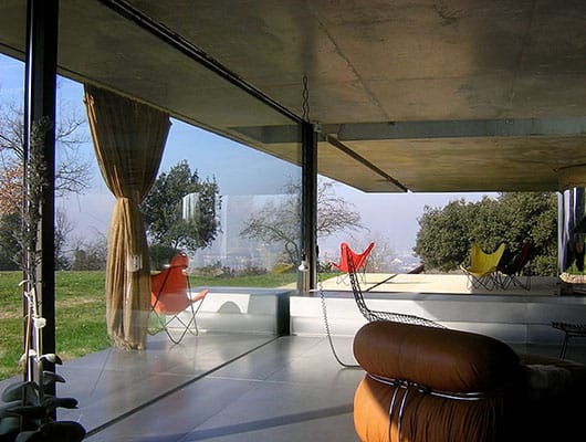
The Maison de Bordeaux
When deciding on a style for his new home, French newspaper publisher Jean-François Lemoine commented "Contrary to what you would expect. I want a complex house because the house will define my world." Disabled from a car accident, he wanted a home that would provide "complexity and interest" while also being suitable to both his needs and the needs of his family. He hired Koolhaas to create a uniquely personalized home that would come to include three levels built around a central mobile platform, functioning like an elevator, used as Lemoine's office.
The home combines three separate living spaces, accessible by the mobile office platform, that shifts in orientation and usage on each floor. The hydraulic platform is key to Lemoine's ability to experience the home. Because the home rests on a hill, the bottom floor is partially underground with transparent and opaque glass panels that open to a beautiful below-ground terrace. The floor contains mostly private space that includes kitchen, laundry, a wine cellar, the TV room, and utility area. The second level is mostly a gathering place for family and friends. It is open on all sides enclosed only by glass walls that measure 13 ft. in height. Two large floor-to-ceiling glass panels open to create outdoor access to the lawn and motorized curtain walls give the family privacy when needed. In all its gracious openness, this living space is bounded and defined by the weighted material on both the floor and ceiling. The top floor consists of two separate sleeping areas, one for children and one for adults. This level is more private, made of concrete only broken by porthole windows providing beautiful vistas.
The house seems to be a juxtaposition of opposite forces: balance and imbalance, opacity and transparency, weight and weightlessness. The theme of a dualistic lifestyle is supported by the contrast between the glass and mesh walls of the second floor and the cement of the third. Koolhaas proposed a house that was the compilation of three houses stacked on top of one another; each with their own unique characteristics and spatial conditioning.
Bordeaux, France
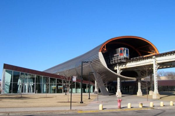
McCormick Tribune Center
Koolhaas designed the McCormick Tribune Center at the Illinois Institute of Technology in 2003, to fulfill the need for a centralization of student life and activities on campus. The design envelopes a train track by encasing it in a 530 ft. stainless steel tube placed above a 110,000 sq. ft. building. Although structurally sound, the Center was designed to appear as if it were bursting out from the middle of the building, under the duress of the train. Huge glass windows and reflective aluminum flooring create a bright space. Translucent yellow-orange, honeycomb-shaped Panelite covers much of the front, spreading warm light throughout the interior spaces. The building also features a larger-than-life graphic of the legendary architect Mies van der Rohe, created by the communications group 2x4, is composed of hundreds of miniature drawings of stylized figures. Much of the interior incorporates 1950s-style mint green and a generous use of mind-activating deep red, hues which dominate the computer pod areas. The space includes a bookstore, café, auditorium, computer center, meeting spaces, and offices for student organizations.
The Center was designed to fulfill the students' need to have a center with "curb appeal" that would be "vibrant, inviting, and active." The extraordinary challenge was working within the bounds of a difficult site split by a railroad track and defined and confined by a series of adjacent steel and glass Mies van der Rohe buildings on either side. Koolhaas formed a bridge between his work and that of his predecessor. While paying homage to Van der Rohe with windows that framed his buildings, Koolhaas combined them with an almost Warhol-like pop culture attitude. Glass, concrete, and steel elements were utilized by Koolhaas to imply instability. His use of bright colors and large-scale graphics created a trendy aesthetic that appeals to college students. The avant-garde feel is enhanced by irregularly-arranged rooms that suggest movement and intrigue rather than well-balanced symmetry. The excitement of nightlife is enhanced by the subterranean red areas, and the warmth and activity generated with the Panelite. As a result, a 24-hour, urbanesque energy permeates the center.
Chicago, Illinois
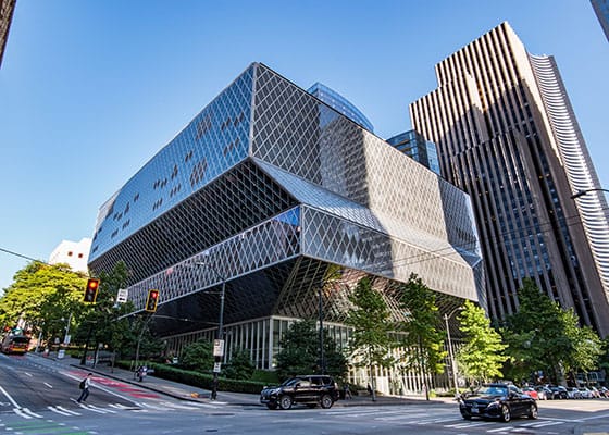
The Seattle Central Library
The newest version (3rd) of the eleven-story, 362,987 sq. ft., Seattle Central library was designed by Koolhaas in conjunction with LMN architects of Seattle to be a center of all types of informational media. The Library's Board of trustees picked Koolhaas to design the building in 1999, citing his "intellectual approach" to the library of the future. Conceived as a "celebration of books," with a capacity for 1.5 million volumes, the library design centers around a Book Spiral. The central four-story ramp gradually ascends making it possible for people to search through volumes of nonfiction books. Floor graphics utilize the Dewey decimal system from 00 to 999. Light pours into the building through a glass and steel exoskeleton.
In an effort to keep costs down, standard materials were used both inside and out including glass triangles, aluminum floors, stained recycled wood, carpets wired with metal for contiguous water cleaning, concrete, and thick layers of colored polyurethane.
The interior is divided into five distinguishable blocks. These independent platforms are vertically stacked to get the best views of the city and its natural environment. Usage of interior space includes everything from a parking lot to a café. The main library includes public reading areas, information spaces, collections, reading rooms, administrative offices, and a terrace on the roof. Highlights include a large 50 ft. high "living room" for meetings, an auditorium with 275 seats, and a space for charging and using computers named the Mixing Chamber.
Color is pervasive throughout. The children's reading and activity spaces have blue seats with bamboo floors surrounded by accents of pink and yellow. The hallway walls, floors, and ceiling of the meeting level are painted in deep shades of red and pink, while the meeting rooms themselves are painted in browns and grays. The escalators are finished in fluorescent lime. Artwork adds to the color palette including a handcrafted floor piece in 11 languages by Ann Hamilton. A Gallery space holds an 8 x 27 ft. bronze enamel glass screen of Puget Sound by James Fitzgerald and Margaret Tomkins and textile pieces based on children's folktales by Mandy Greer highlight areas in the children's section.
Seattle, Washington
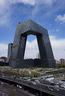
CCTV Headquarters
The China Central Television Headquarters, boasting 5.5 million square feet of office space spanning 51 floors at 750 feet tall, is home to both administrative and studio/workspaces. Two towers that lean inward are bound by two horizontal structures housing production studios and other facilities including a kitchen, gym, and meeting rooms. One tower, used for production and editing and the other, used for news broadcasting, are connected by a 246.5 foot cantilever that holds administrative offices. Koolhaas worked with engineering teams from China and the EU, utilizing glass and reinforced steel to create an "irregular diagonal grid of steel combined with steel-reinforced composite columns, braces, and beams." The placement and density of the grid is dependent on the structural rather than decorative needs. It resulted in a variegated pattern over the entire surface of the building. A grey sun-shaded glass was used on the façade, allowing it to "disappear" leaving just the pattern from the asymmetric steel grids.
The CCTV building is an ingenious design in which form follows function facilitating the process of television production up through the two opposing sides. It appears to be almost a continuous square tube, presenting a semi-warped, overall square-like visage. In designing the building, Koolhaas asked the questions, how can you make a high-rise building that's not about height? How can you make a high-rise building that can define a place rather than simply occupy it? His ultimate visual goal was to create a building that was not the same on all four sides but would look and feel different from various viewpoints lending itself to imbalance and variety as opposed to the dense symmetrical shape of a normal skyscraper. He believed his design would ultimately "combine and link a range of conditions in a given zone without transforming everything into a dense and vertical megacity." His Deconstructivist orientation made it important for him to design a building which would fit into a city plan but also challenge the cultural need for symmetry.
Beijing, China
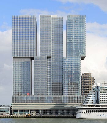
De Rotterdam
Described as a vertical city, the De Rotterdam features three interconnected mixed-use towers that house offices, apartments, a hotel, conference facilities, shops, restaurants, and cafes. The significant high-rise in the city of Rotterdam, marked by its offset stacked appearance, was created as part of a masterplan to regenerate a port area that was used by the De Rotterdam ship (operated by Holland America Cruise Line). On the inside, fine details and rich materials such as brass, timber, translucent plastics, and floor-to-ceiling windows are bounded by concrete.
As is the case with many modern high-rises there was little room for decorative elements, with an emphasis on construction over surface quality. The facades of the De Rotterdam were built with glass and vertical aluminum mullions forming an aluminum framed glass "curtain" that covered a solid concrete and steel structure. Designed in blocks to allow for functional flexibility for residential and commercial facilities, the building has three separate access points and some shared common areas. They had, as Koolhaas says, "shifting relationships to each other," whereas current needs could direct the spaces' identities and usage at any given time. In true homage to the ship of their namesake, the towers allow for visibility of Rotterdam's skyline and the North Sea.
Rotterdam, Holland
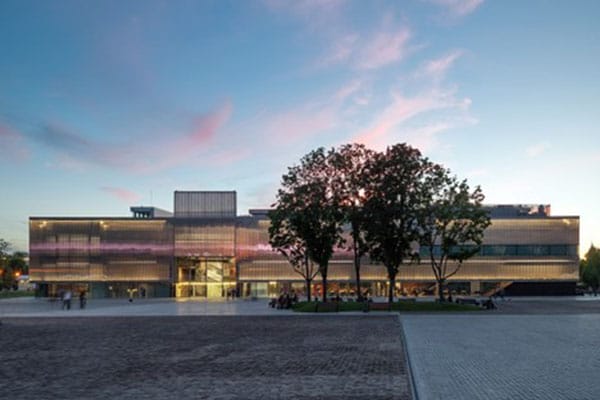
Garage Museum of Contemporary Art
The design of the Garage Museum of Contemporary Art was envisioned as a constructive reuse project. The building originally known as Vremena Goda Café (Seasons of the Year Café), created by the prolific Modernist architect Igor Vinogradsky in 1968, was part of an overall re-development plan for Gorky Park in Moscow.
For the redesign, Koolhaas chose to maintain and enhance several elements from the original restaurant which was constructed as a prefabricated concrete pavilion. He accomplished this in several ways, the most dynamic being the enclosure of the existing structure with a translucent double layer polycarbonate façade. This addition permits visitors not only to see the underlying rectangularity of structure but also view the complex inner workings of the museum's ventilation system. The viewer is left with a combination of rectangular forms overlayed by shapely structural elements.
In addition to maintaining the concrete core, Koolhaas kept several decorative elements, including a terracotta staircase, patterned tiles, brick wall façades, and a large mosaic. Several of the design elements enhance the flexibility of museum exhibition space including folding white walls that hang down for a more neutral backdrop in front of the brick. Two façade panels lift to enlarge the space for sculptural installations and to increase continuity and flow. A public loop circulates around the concrete core allowing for greater visitor movement through the bookshop, auditorium, and a café. This café was a self-contained structure defining interior spaces and creating a clear separation between interior and exterior space. The building also includes five exhibition rooms, education facilities, and a children's area.
Because of renewed interest in Soviet culture, the developers wanted to create a balance between "preservation and remodeling." While Koolhaas' design style and approach differed from Vinogradsky's, they were both influenced by Constructivist architecture, and both worked within the Modernist style utilizing glass and concrete. Both designs are based on the rectilinear structure that Vinogradsky originally implemented. Koolhaas did not restore any of the original elements but rather fortified them and included them into the new design. He said "The building is a ruin, but it is not a very old ruin and there are still traces of decoration. ... - we have these traces of Russian history as a partner of the art."
The Garage allows for exchange between the museum and the park blurring the lines between interior and exterior space and between public space and building functionality.
materials - Moscow, Russia
Biography of Rem Koolhaas
Childhood
Rem Koolhaas was born to Anton Koolhaas, a novelist, screenwriter, and critic, and mother Selina Pietertje Roosenburg on November 17, 1944, in the Dutch city of Rotterdam. His father's appointment as a cultural director brought the family to Amsterdam from 1946-1952, and to Jakarta, Indonesia from 1952-1955. Living abroad exposed the young Rem to the vibrant, raucous nature of a country transitioning from colonialism to independence, broadening his cultural horizons at an early age.
On return to Amsterdam after World War II, Koolhaas and his bohemian family witnessed a transition from the ruins of war to modernization, especially when it came to a global but community-based re-design of the city. During this period, he spent time cultivating a passion for swimming, a hobby that would inform his future work ethic. He later said, "When I have swum, I have a wonderful moment of emptiness and calmness." Movement would later become synonymous with the jet-setting architect, alongside his calm clarity and patient determinism.
In his early twenties, Koolhaas dove into the European cultural scene, becoming involved with a group of Dutch Surrealist writers and frequenting the Museum of Modern and Contemporary Art, discovering artists that would strongly influence his personal aesthetic such as Lucio Fontana, Robert Rauschenberg, Daniel Spoerri, and Jean Tinguely.
Early Training
Before he was an architect, Koolhaas followed in his father's footsteps and became a journalist for the Haase Post in The Hague. He even attended film school with ambitions to be a screenwriter. According to IMDb Koolhaas was part of a group of "budding native Cineastes" including Rene Daalder, who joined him in the creation of an unproduced script, Hollywood Tower, for director and producer Russ Meyer. This journalistic and filmmaking experience provided Koolhaas with keen writing, research, and observational skills that allowed him to express his ideology verbally and visually, which would later lead him to see things in a slightly different way than most of his contemporaries.
In 1968, Koolhaas' interests veered toward urban theory, and he enrolled at the Architectural Association in London, with which he would maintain a longstanding relationship. Years later as a member of the faculty he would mentor Zaha Hadid, who became an employee of OMA, his architectural firm, and went on to gain worldwide prominence. In 1972, Koolhaas left Europe to pursue further studies at Cornell University, in Ithaca, New York. While there, he became influenced by the work of Professor Oswald Ungers, a German architect and theorist known for rationalist design and cubic forms.
Although Ungers' work employed urbanism, psychology, and sociology in metropolitan design, Koolhaas' early explorations in architecture would take more of a Humanist and Deconstructivist approach. Humanist philosophies centered around the influence of the human factor as a key consideration in architectural design. Deconstructivism allowed for myriad new possibilities in architectural form and volume that contradicted traditional ideas of symmetry and preconceived notions of what buildings could be. Ungers and Koolhaas would eventually work together to create The City in the City, Berlin: A Green Archipelago (1977), a piece based on the idea that architecture should focus on the problems of "changing urban demographics and recession."
While in Ithaca, Koolhaas married the Dutch artist Madelon Vriesendorp. The couple had two children: daughter Charlie and son Tomas. Tomas would go on to create a documentary about his father titled REM in 2016.
Koolhaas' time at Cornell was followed by a Harkness Fellowship at the Institute for Architecture and Urban Studies (IAUS) in New York City, where he studied under Philip Johnson and Peter Eisenman. It was under Eisenman's guidance that he wrote one of his most important manifestos: Delirious New York: A Retroactive Manifesto for Manhattan (1978) establishing himself as an urban theorist. Koolhaas and his wife collected various materials such as postcards, magazines, and books about the history of New York City as research tools and Madelon created the cover. The publication spurred increased notoriety for the Koolhaases who had, three years prior, established The Office for Metropolitan Architecture (OMA) in New York alongside the architect/artist couple Elia and Zoe Zenghelis. Ironically, although the book catapulted Koolhaas' conceptual ideas (most specifically with his assertion that architectural development is an organic process created through a place's cultural forces so that cities become a metaphor for contemporary experience) he had yet to build an actual piece of architecture.
At the time, OMA was operating as a think and design tank. Koolhaas, his wife, and the Zenghelises were busy producing many building designs for competitions such as the new Dutch parliament building in The Hague (1978). Koolhaas encouraged this practice because he believed developing well-thought-out proposals would lead to a greater architectural archive for his firm's future developments as well as keep his work on the international architectural radar.
In the early 1980s, OMA began to see their first major commissions including The Netherlands Dance Theatre in the Hague and IJ-Plein Urban Planning in Amsterdam. Other projects steadily followed and in the late 1980s and early 1990s, OMA gained world renown through a series of victorious competitions including the Tres Grande Bibliotheque and two libraries for Jussieu University in Paris. OMA also designed groundbreaking residential properties including the Maison'a Bordeaux for a wheelchair-reliant client which featured a central platform that traversed up and down between floors, hearkening back to Koolhaas' earliest swimming lessons in movement, and how the movement and existence of individuals within a space should inform a building's design.
In 1995, the same year as he published S, M, L, XL which chronicled the accomplishments of OMA thus far, Koolhaas began teaching graduate seminars at Harvard University. Together, he and his students created The Guide to Shopping (2000) which inspired Muccia Prada, the Italian luxury brand's creative head, to seek Koolhaas out to design retail store experiences. In 1998, AMO, an effort within OMA focused on non-architectural work, was established as a research and design studio in the areas of media, technology, publishing, and fashion. OMA and AMO worked together to generate store designs and runways around the world.
Mature Period
The 21st century ushered Koolhaas into his current role as "starchitect," a term used to describe architects who have reached celebrity status. Other "starchitects" include such giants as Frank Gehry, Zaha Hadid, and Le Corbusier. Koolhaas' rise to stardom is in no small part due to winning of the Pritzker Architecture Prize in 2000, along with his much-publicized jet-setting around the world for projects such as the massive Central China Television Headquarters building in Beijing. His fame was also a result of his principles that eschewed any particular style in favor of spending time and resources exploring an area so that the people, the environment, and the individual concerns of the project would be the sole ingredients in its conceptualization. As architecture critic Nicolai Ouroussoff stated, "Koolhaas' habit of shaking up established conventions has made him one of the most influential architects of his generation. (...) The attraction lies, in part, in his ability to keep us off balance. Unlike other architects of his stature, such as Frank Gehry or Zaha Hadid, who have continued to refine their singular aesthetic visions over long careers, Koolhaas works like a conceptual artist - able to draw on a seemingly endless reservoir of ideas."
OMA would grow to include over 300 architects with offices in Rotterdam, New York, Beijing, Hong Kong, Doha, and Dubai. In 2008, Time magazine named Koolhaas one of the world's most influential people.
In 2012, Koolhaas and Madelon divorced. Shortly thereafter, he began sharing living space with British-born, Dutch designer Petra Blaisse, who says that she and the architect have been together since 1986, not living together, "but having a life together."
In 2014, Koolhaas added curator to his list of titles, by directing the 2014 Venice Architectural Biennale. Then, at the 2020 exhibition Countryside: The Future, at the Guggenheim Museum in New York, he, as an urban theorist, directly explored the country, and all its possibilities, to raise awareness not only of the balance between the city and the country but also establishing the premise of a cultural shift towards the countryside and how we exist with respect to it. In a TIME Magazine article at the time, arts editor Belinda Luscombe wrote: "The architect who rose to fame largely for a book, Delirious New York, that celebrated New York City for its density and crowdedness has now turned his attention to less inhabited spaces, especially the countryside. To him, the gathering of more than 50% of the world's population into metropoles that occupy just 2% of the world's land mass was a problem long before anybody knew what the phrase social distancing meant."
Current Work
Luscombe also stated, "If there is a theme to Koolhaas' body of work - which has spanned buildings in cities as diverse as Moscow, Milan, Beijing, Seattle and Seoul, as well as at least 10 books (he co-authors many) it is this: he's drawn to that which he feels has been given insufficient attention by his peers, whether it's a point of view, a building material, the retail experience, or a city in Nigeria."
Today Koolhaas continues to travel the world overseeing OMA's multiple locations and work while also maintaining a hearty roster of his own projects through the firm. In 2022 alone, he completed several immersive fashion show environments for brands Prada and Miu Miu, helped design a line of modular furniture called Principles in response to the pandemic's shaking up of people's work and office lives, and saw the Taipei Performing Arts Center to completion.
Other ongoing or long-term projects that are still in the works for Koolhaas include 50,000 housing units over three sites in France that will allow the region of Bordeaux to absorb population growth in a sustainable way, the live/work HIA Airport City development in Qatar, and a second building for the New Museum, which marks OMA's first public building in New York City.
Koolhaas continues forward with a momentum always focused on the future, always propelled by the challenges of new space, new ideas, and new ways to explore movement and place. He spends much of his time exploring societal issues, observing, analyzing, and guiding cities to evolve organically within a context of the societal and cultural norms of their unique, individual communities. He still swims as often as he can and shows no signs of slowing down.
The Legacy of Rem Koolhaas
Koolhaas has bestowed upon his students, OMA proteges, and the world at large an expanded lens of architecture's potential wherein globalization is a means to create diversity (not homogeneity) in design. His eclectic design orientation and research-based style has opened the minds of architects and communities to the idea of problem solving within a cultural context rather than building toward a personal aesthetic or textbook formula. His thoughts on melding public and private spaces to enhance community engagement have motivated architects to build with respect to the environment. Koolhaas' ability to identify urban trends and convey his thoughts through writing with an understanding of architecture past, present, and future has enabled architects to see ways in which to integrate different architectural styles while re-inventing and updating older buildings. His Junkspace work has challenged planners to rethink the contemporary architecture of airports, shopping malls, and business centers often formed by vastly interconnected wasted spaces.
Because Koolhaas leads by example, OMA has become a veritable training ground for architects who start their own, or become part of, successful architecture firms all over the world, including Tokyo based SANAA, Studio Gang, and Foreign Office Architects.
Influences and Connections

-
![Le Corbusier]() Le Corbusier
Le Corbusier - Oswald Ungers
- Constant Nieuwenhuys
- Bjarke Ingels
- Samir Bantal
-
![Frank Gehry]() Frank Gehry
Frank Gehry - Peter Eisenman
- Charles Jenks
- Jeanne Gang
- Reinier de Graaf
-
![Zaha Hadid]() Zaha Hadid
Zaha Hadid - Hans Ulrich Obrist
- Petra Blaisse
-
![Deconstructivist Architecture]() Deconstructivist Architecture
Deconstructivist Architecture - Metabolism
- Structuralism
Useful Resources on Rem Koolhaas
- Makers of Modern Architecture, Volume II: From Le Corbusier to Rem KoolhaaBy Martin Filler
- Oma/Rem Koolhaas: A Critical AnthologyBy Christophe Van Gerrewey
- Delirious New York: A Retroactive Manifesto for ManhattanBy Rem Koolhaas
- Junkspace with Running RoomBy Rem Koolhaas and Hal Foster
- Koolhaas. Countryside, A ReportBy AMO, Rem Koolhaas, Harvard Graduate School of Design, The Beijing Central Academy of Fine Arts, Wageningen University, the Netherlands, The University of Nairobi
- Project Japan: Metabolism TalksBy Rem Koolhaas, Hans Ulrich Obrist, Kayoko Ota, James Westcott
- Rem Koolhaas. Elements of ArchitectureBy Rem Koolhaas, Harvard Graduate School of Design , Stephan Trüby, James Westcott James Westcott, Petermann
- S M L XLBy Rem Koolhaas, Bruce Mau, Hans Werlemann
- Harvard Design School Guide to ShoppingBy Rem Koolhaas, Jeffrey Inaba, Sze Tsung Leong, Chuihua Judy Chung, Benedikt Taschen
 Ask The Art Story AI


