Summary of Beaux-Arts Architecture
An imposing and often decadent style, Beaux Arts buildings combined many of the main features of classical architecture, particularly columns and symmetry, with eclectic and decorative elements drawn from other historical styles. Beaux-Arts Architecture was intended to be a French national style, but the approach also found prominence in the United States, and a handful of other locations throughout the world. It was most commonly used for public and civic buildings such as museums, art galleries, libraries, and university campuses.
Key Ideas & Accomplishments
- Beaux Arts buildings tended to feature sculptural decoration and this could take many forms from statuary to relief panels and inscriptions. This decoration was carefully designed to communicate the purpose and identity of the building through details including the names and faces of famous individuals and relevant mythological references. Sculptural features were often complemented by additional internal and external elements such as murals and mosaics which also reflected the building's function.
- Technology and industry were very important to Beaux Arts architects and this reflected wider trends of the period, most notably the Industrial Revolution. Beaux Arts architecture pioneered the use of new materials such as cast iron, pairing it with large areas of glass to create light-filled spaces. Some of the most famous Beaux Arts buildings, such as train stations, also reflect the impact of technology of people's daily lives and these can be seen as a glorification of new machinery and knowledge.
- Classical details continued to be prominent within the Beaux Arts canon, but these were used in an increasingly eclectic fashion. Although notions of symmetry and the widespread use of columns remained important, these were paired with features such as arched windows and doors, rustication, and raised first stories.
Artworks and Artists of Beaux-Arts Architecture
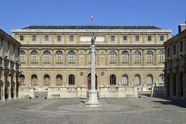
École des Beaux-Arts
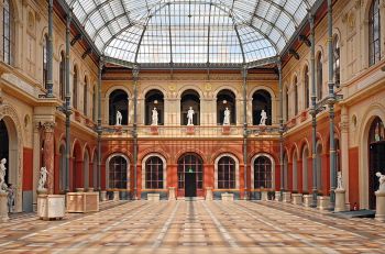
Facing an interior courtyard, the École des Beaux-Arts building employs horizontal and vertical symmetry to create a sense of elegant balance. The raised first story of rusticated stone features a central arched doorway with arched windows on either side. Copies of noted art works, including the Apollo Belvedere, and the Dying Gaul, are placed between each of the windows, and in the horizontal band between the first and second stories, the names of noted artists, including Michelangelo and Leonardo, are inscribed. Ionic columns with a Baroque-style capital frame the second floor's arched windows, while the third floor's rectangular windows are framed by square classical columns, and small panels containing cartouches. These details create a sense of variation and hierarchy, while the windows, placed with vertical symmetry, create upward movement.
The early work on the building (1819-32) was completed by François Debret, Duban's teacher. The two became working colleagues and, then, brothers-in-law when Debret married Duban's sister. Taking over the project in 1832, Duban pioneered the Beaux-Arts style with his innovative inclusion of decorative motifs within a classical form, based upon the proportionality and rational symmetry of Roman architecture. His use of decorative columns, arched windows, garlands, cartouches, and inscriptions became defining elements of Beaux-Arts architecture. He continued to work on the project for most of his life, designing the rest of the campus to frame the central building, shown here.
Stone, iron, glass - Paris, France

Bibliothèque Sainte-Geneviève
This monumental two-story building, built out of limestone, employs symmetrical columns and arches to convey a classical effect and these are combined with elements of a Renaissance palazzo. The building, occupying a wide but shallow site, is located on a hill directly across from the noted Neoclassical Panthéon (1758-90), and the garland band at the top of the first level of the library echoes a similar band on the Panthéon, mirroring and reflecting its surroundings. Inscriptions of the names of over 800 scholars on the façade help to communicate the building's purpose.
Visitors enter on the lower level through a central vestibule, which is decorated with murals of gardens and busts of French scholars, symbolizing the start of the search for knowledge. The reading room takes up the entire second level and unusually, the primary decorative elements of the building were placed here, rather than on the facade. The building was particularly innovative due to its internal cast iron framework, a new architectural material, and Labrouste's design pioneered the Beaux-Arts use of the latest technologies. In the reading room, this frame is celebrated, rather than concealed, with sixteen columns supporting a dramatic barrel-vaulted ceiling. This, in addition to the large windows, create an impression of light and space. Both Labrouste's use of new materials and the openness of the reading room also had a significant influence, not only on the Beaux Arts movement, but on the later development of modern architecture.
Cast iron, glass, stone, limestone, masonry - Paris, France
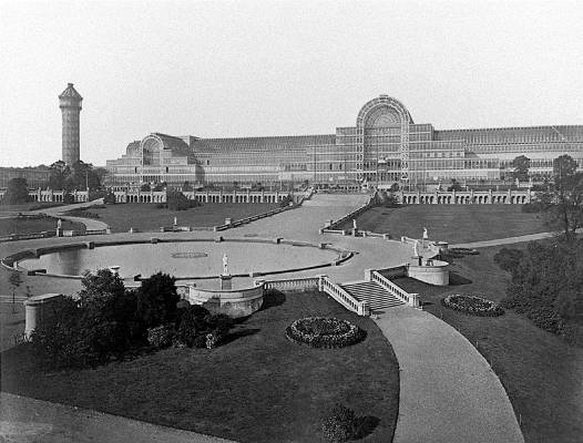
Crystal Palace
In the 1800s British architecture focused on romanticized styles such as Tudor Revival and Gothic. As a result, examples of Beaux Arts buildings were rare. A dramatic and noted example, however, was Joseph Paxton's Crystal Palace (1851), designed for the Great Exhibition in London of the same year. Built initially in Hyde Park, it was later relocated to an area of South London called Penge Common, where it remained from 1854 until its accidental destruction by fire in 1936, an event that was described by Prime Minister Winston Churchill as, "the end of an age".
Based on the model of a greenhouse, Paxton used prefabricated glass and iron, built off site and then set on concrete footings, to design the massive but light-filled exhibition space. The design of the building drew upon Beaux-Arts monumentality and symmetry but at the same time was remarkably innovative in employing industrial materials and processes, particularly the use of a new sheet glass method which made the structure possible. When created, it was the greatest area of glass ever seen in a building and it was hugely novel in that it did not require interior lighting. It's influence on the modern era is noted by historian Dora P. Crouch who wrote, "it seemed a new kind of space had been created - an indeterminate space that would become characteristic of the next century".

Opéra Garnier
The façade of the Opéra Garnier, rising to a copper clad dome, emphasized by a pair of gilded statues on each side, and a statue of Apollo, the Greek god of art, at the center is both grand and opulent. At the same time, incorporating arched entrances on the first level and Corinthian columns on the second, the building conveys classical balance, strength, and solidity. The building's placement as the terminal axis of the Avenue de l' Opéra speaks of its importance to the community, while the many statues portraying Greek gods and busts of great composers along with marble friezes, symbolically communicate the building's purpose. Nearly eighty artists worked on the detailed ornamentation of the façade, employing a variety of materials and techniques, including new technologies such as electroplating.
Garnier's design won a competition for Napoleon III's commission of the new opera building. Whilst epitomizing Beaux Arts, the design also emphasized Garnier's view that no surface should be left undecorated. The building was constructed around a metal frame and this allowed for an incredibly spacious interior, renowned for its performance spaces and its grand staircase, all lavishly and symbolically decorated. Art historian Andrew Ayers wrote, "A giddy mixture of up-to-the-minute technology, rather prescriptive rationalism, exuberant eclecticism and astonishing opulence, Garnier's opera encapsulated the divergent tendencies and political and social ambitions of its era".
The building was internationally influential, becoming the model for theatres in Poland, the Ukraine, Brazil, Vietnam, and India, as well as other noted structures, including the Thomas Jefferson Building of the Washington, D.C. Library of Congress. It's also taken on a noted cultural life, becoming the setting for Gaston Leroux's famous novel The Phantom of the Opera (1910), which was adapted in later films as well as in Andrew Lloyd Webber's 1986 musical.
Stone, marble, cast iron, glass - Paris, France
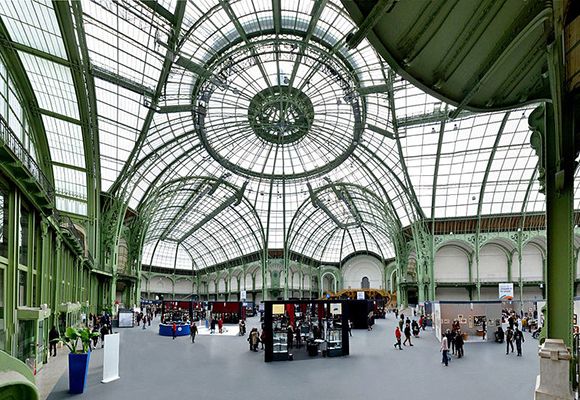
The Grand Palais
The façade of the Grand Palais emphasizes the imposing temple-like entrance by employing pairs of classical columns, and projecting towers, capped with monumental sculptures, as a framing device. Placed against a single vertical rectangular window, the statuary at the base of each tower draws the eye upward to the steel and glass barrel-vaulted roof. Wings with colonnades and statues symmetrically placed atop the balustrades create a linear flow. A grand effect is created, suggesting the sweep and range of the "monument dedicated by the Republic to the glory of French art", a phrase inscribed on one of its pediments.
Girault was inspired by Paxton's Crystal Palace (1851) as the use of an iron and steel framework with extensive glass made it possible to have enough light in enormous exhibition spaces before the arrival of electricity. Girault's glass vaulting, iron and steel framing, and reinforced concrete were technically innovative in a building almost a half-mile long. In style, his work first introduced the use of Art Nouveau ironwork to ornament the massive building. The statue groups, created by a number of sculptors, vigorously express both the tradition and power of French art. Georges Récipon's bronze quadriga, or chariot drawn by four horses, stands on top of the end of each wing, one depicting Immortality prevailing over Time, the other Harmony triumphing over Discord.
Girault studied at the École des Beaux-Arts and in 1880 won the Prix de Rome, and the Grand Palais was one of his first major commissions when he returned to Paris. He supervised and worked with the architects Henri Deglane, Albert Louvet, and Albert Thomas in creating the building, meant as the major exhibition place for the Universal Exposition of 1900. As part of the project, he also created the Petit Palais (1897-1900), a trapezoidal building that incorporated elements of French architecture from the late 1600s to early 1700s. Both buildings reinforced France's leadership in architecture and have been recognized in the modern era as historical monuments. As a result of his work, Girault received a number of royal commissions for buildings in Belgium, and his architecture became the model for other museums both in Europe and South America.
Steel, iron, glass, and stone - Paris, France
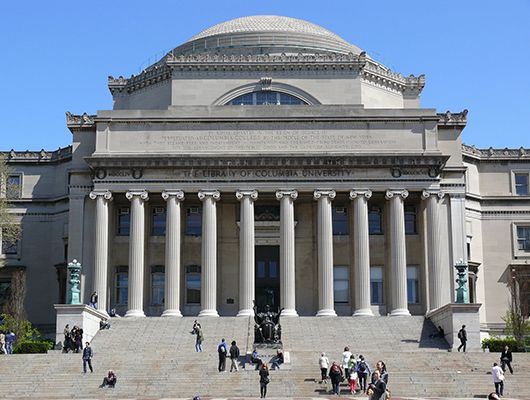
Low Memorial Library at Columbia University
A long, wide flight of stairs draws the eye upwards to the temple-like portico, a colonnade of Ionic columns and a large rotunda. The entrance, elevated above the street, conveys a sense of imposing rationality and solidity, emphasizing the importance of the pursuit of secular knowledge, as the building overshadows the two smaller religious buildings built on either side. The design combines elements from Rome's Pantheon (113-125 C.E.) with a Greek cross plan, and windows modeled from the Roman Baths of Diocletian (298-306 C.E.), situating it within the classical tradition. The design and decoration of the building, however, also reinforces its role in preserving and communicating knowledge. An inscription above the portico honors Columbia's history and the interior of the building includes various symbolic mythological figures, including busts of Athena, goddess of wisdom, Zeus, ruler of the heavens, and Apollo, god of the arts as well as depictions of the philosopher Demosthenes and the playwrights Euripides and Sophocles.
McKim was renowned for his designs of libraries, also designing the Boston Public Library and the Morgan Library in New York City in which he combined classical references with elements drawn from the Italian Renaissance, as architectural historian Leland M. Roth wrote, his "formal training and innate sobriety provided clarity of form". In a similar vein, art critic Christopher Grey has characterized his work as "studied, reserved, archaeological", and his approach necessitated that every element and material met his exacting standards.
Columbia's President Seth Low, who financed the project with his own funds when the University was reluctant, commissioned the new library in 1895 as the first building of the Morningside campus. Named in honor of his father, the library, though it has been an administrative building since the 1930s, is the dominant feature of the campus and has been designated a New York City Landmark and a National Historic Landmark.
Stone, Connemara marble, green Vermont marble - New York City
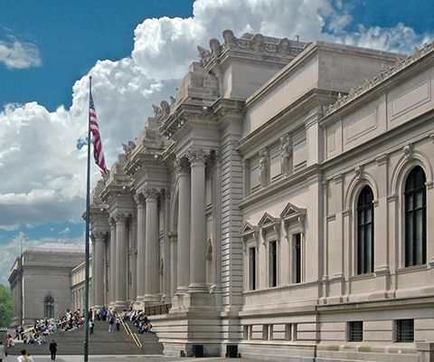
Metropolitan Museum of Art
The iconic entrance to the museum is composed of three grand arches, each with a keystone bust of the Greek goddess Athena, representing wisdom. The arches are framed by pairs of freestanding Giant Order columns, so named because they extend through multiple stories. Medallions depicting Old Masters, including Michelangelo, Raphael, Durer, and Rembrandt are placed on either side above the arches, pointing to the building's function. The two wings, lower and slightly set back, emphasize the grandeur of the central rectangular section. Approached by a series of steps rising up from Fifth Avenue, the building has the effect of a monumental temple of art.
Richard Morris Hunt designed the façade, and, following his death, his son completed the plan. Due to funding issues, however, some of Hunt's original designs were altered considerably. For instance, the museum was built in Indiana limestone rather than the intended white marble. Hunt had also planned to include more decorative sculpture; the blocks of stone at the top of each pair of columns were to be carved to show the four great periods of art - Egyptian, Greek, Italian (Renaissance), and the modern - but, as the plan was not carried out, the heavy stones remained. Additionally, niches were created, but no statues were placed in them until 2019, when these have become the location for an annual commission. First on display were four works by Kenyan-American artist, Wangechi Mutu called The NewOnes will free Us. Despite these changes, when completed, one newspaper hailed the building as "the most monumental example of architecture in America" and art critic Albert Ten Eyck Gardner argued that the uncarved stones "introduce a welcome note of rugged simplicity into an otherwise self-consciously correct Beaux Arts design".
Indiana limestone, glass, iron - New York City, New York
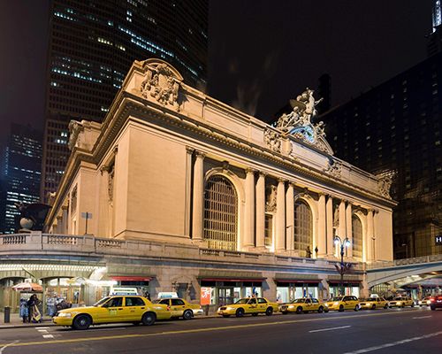
Grand Central Terminal
An icon of New York City, Grand Central Station exemplifies the stately grandeur that the Beaux-Arts style gave to major train terminals, seen as defining monuments to the industrial age. Double columns frame each of three large arch windows, their steel lattice work and glass allowing light to flood into the interior. The geometric designs on the windows and skylights reinforce notions of industry as well as pre-empting Art Deco styles. Inside, the ceiling depicts the constellations and this was designed by architect Whitney Warren along with the French artist, Paul César Helleu and emphasizes the size and openness of the main concourse.
The exterior of the building is dominated by Jules-Félix Coutan's Glory of Commerce (1911-14), a 48-foot high statue that depicts Mercury, the Greek god representing trade and travel, standing on a large 13-foot clock with Hercules, representative of physical strength, and Minerva, goddess of wisdom and guardian of cities, on either side of him. With flared wings and a fierce attitude, an eagle, representing both Zeus, ruler of the heavens, and America, stands behind Mercury. As Whitney Warren wrote at the time, the façade was an "attempt to offer a tribute to the glory of commerce ... that this great enterprise has grown and exists, not merely from the wealth expended...but by the brain and brawn constantly concentrated upon its development".
Following a 1902 train collision that resulted in numerous fatalities and injuries, William J. Wilgus, New York Central railway's chief engineer, proposed that rather than a railroad yard with steam engines, the growing city needed a modern terminal with electric trains. Consequently, a design competition was held in 1903 and building began shortly afterwards. New York Central wanted their building to outshine Pennsylvania Station, on which work had begun in 1901. Although Penn Station was completed earlier, in 1910, Grand Central opened in 1914 as the largest train station in the world, covering 48 acres and including 44 platforms. In conjunction with the terminal, an area called the Grand Central Zone, surrounded the area with hotels, luxury apartment houses, and new office buildings, leading the New York Times to call it "a monument, a civic center...a city." The building is designated as a U.S. National Historic Landmark and is a top tourist attraction. It has been used in countless films and television shows, where it has come to symbolize the city itself.
Bedford limestone, granite, Tennessee marble, Botticino marble, Caen stone, iron, glass - New York City, New York

Jefferson Memorial
This monument, honoring Thomas Jefferson, employs circular steps leading up to the protruding portico with its eight Ionic columns rising to a triangular pediment. The contrast between the rectangular portico and the building's colonnaded circular form, rising to a shallow dome, creates a sense of elemental and classical balance. Made of Vermont Imperial Danby white marble and open to the elements, the building resembles many classical temples, designed to be approached from any direction. At the same time, the building and its prominent location, pays homage to both the Roman Pantheon (118-125 C.E.) and Jefferson's design for the Rotunda (1822-26) at the University of Virginia. Adolph Alexander Weinman's relief, depicting five of the writers of the Declaration of Independence, is carved in the pediment.
In 1925 Pope had the winning design in the competition initiated by President Theodore Roosevelt for the proposed memorial, though Congress did not fund the project, and it wasn't until 1935 that the proposal was revived under President Franklin Roosevelt. The project was controversial at the time, as the Commission of Fine Arts argued that it would spoil the open view of Pierre L'Enfant's 1791 plan of Washington, and other argued against the cutting down of the mature cherry trees in the area. More importantly, in contrast to the rising modern style of architecture, the Beaux-Arts style was seen as out of date. As art historian Arthur Drexler wrote, "By the last years of Beaux-Arts influence in America, a classicism stripped of the Orders and sometimes even of ornament sought to keep pace with the emerging modern style. And yet one of the last major Beaux-Arts buildings... Pope's Jefferson Memorial...reasserted classical values."
Marble, limestone, granite Vermont Imperial Danby marble, Georgia marble, Tennessee marble, Indiana limestone, Minnesota granite, Missouri marble - Washington DC
Beginnings of Beaux-Arts Architecture
French Baroque
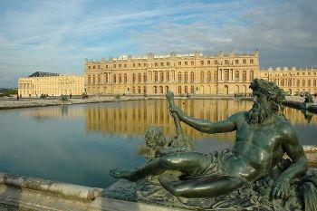
French Baroque architecture (sometimes called French Classicism) combined the scale and drama of Italian Baroque with Greek and Roman theories of harmony to create monumental buildings that demonstrated power and majesty. It developed under the patronage of King Louis XIV (1643-1715) whose reign marked a period of cultural and economic prosperity for France. The Palace of Versailles (1661-1770), designed by Jules Hardouin-Mansart and Charles Le Brun, is the most famous example of the style and the building and its grounds did much to promote ideas of national identity through architecture as well as the importance of uniting design and decoration to create a complete whole (a concept later given the name Gesamtkunstwerk). These ideas informed the development of Beaux-Arts Architecture, in that it promoted the importance of unified decorative schemes and was initially viewed as a uniquely French national style.
Académie des Beaux-Arts
Originally founded in 1648, by the 19th century, the Academy was responsible for both the official Salon, an exhibition that could make or break an artist's career, as well as an elite art school teaching painting, sculpture, and architecture. The school's system of education was highly competitive and rigorous, as students were taught in the atelier, or studio, teaching system. Each year students could compete for the Grand Prix de Rome, which included a fellowship of three to five years in Rome. By the early 1800s, however, the Academy had also become rigidly conservative with the result that innovation in painting was led by artists associated with Romanticism, Realism, and other new movements, in opposition to the tight strictures of the Academy. The Academy's approach to architecture was equally conservative, but a new generation of architects began to challenge this.
Labrouste, Duban, Duc, and Vaudoyer
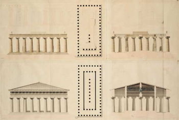
Four students of the school, Joseph-Louis Duc, Félix Duban, Henri Labrouste and Léon Vaudoyer each won the Prix de Rome in consecutive years (1823-26), allowing them to study together in Rome at the Villa Medici. Here, they began creating innovative designs that questioned the strict standards of the school's Neoclassical aesthetic. In 1829, Labrouste's reconstruction of the temple complex in Paestum, Italy, stirred debate about the nature of classical architecture and the educational goals of the school. He argued that the site, which had been much studied as "primitive" as its columns were considered disproportionately short, instead reflected the artistic desire of the designers "to create a new architecture". This pitted Labrouste against some members the Academy as his argument necessitated questioning their long-held beliefs in the purity of classical architecture and in challenging the academic dogma of the institution, he opened up a new field of reference for architects to draw on.
Incorporating elements of Baroque, Renaissance, Gothic, and Romanesque architecture into their designs, the four students sought to create a new and authentic French style. As Labrouste argued, "a building should reflect and express the specific region in which it is built" and Duban advocated for "the importance of achieving a national character in architecture". Their work was timely and reflected wider trends in historicism, including a surge in interest in the Middle Ages caused by the publication of The Hunchback of Notre Dame by Victor Hugo in 1831 and early ideas in building conservation exemplified by the creation of the Commission of Historic Monuments in 1837.
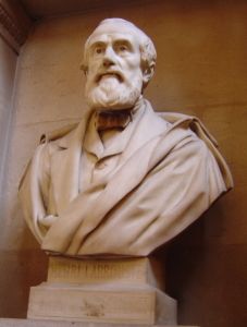
Despite the early antagonism with some members of the Academy's faculty, Beaux Arts architecture was quickly accepted as a modification of the current Academic Style and began to be disseminated through the Academy itself. This may be attributed to the fact that Beaux Arts continued to draw heavily on classical aesthetics, offering continuity between the two. By the early 1830's the young architects had, not only, become leaders among their contemporaries but also received major commissions and the favor and patronage of King Louis Philippe. Duban designed the new building for their alma mater, the Académie des Beaux-Arts, which was renamed the École des Beaux-Arts in 1863 (1832-64) and Labrouste designed the Bibliothèque Sainte-Genevieve (1838-50). Becoming noted teachers, Vaudoyer, Duc, Duban, and Labrouste also taught the next generation of architects, including and Edmond Jean-Baptiste Paulin, and Charles-Auguste Questel.
Beaux-Arts in America
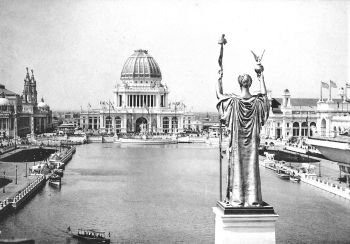
Richard Morris Hunt, the first American admitted to the École des Beaux-Arts in 1846, introduced Beaux Arts architecture to the United States, when he returned in 1855. It was, later, brought to widespread attention through the buildings of Chicago's World Columbian Exposition in 1893. Designed by noted architects, including Burnham, Atwood, and Olmstead, the monumental designs were nicknamed the White City and were seen as the perfect expression of the Gilded Age, a period of great wealth. The designs sparked the City Beautiful movement which sought to reform American architecture and urban planning along Beaux Arts lines. The tenets of the movement were adopted by various American cities, with the most notable example, the Macmillan Plan (1902-26). Named for the U.S. Senator that initiated it, it was a redesign of the National Mall in Washington D.C.

American architects added their own innovations to the Beaux-Arts style, as shown in Hunt's incorporation of Châteauesque features, based on French Renaissance country houses, into his designs for Biltmore House, a private mansion created for George Vanderbilt. Henry Hobson Richardson combined Beaux-Arts spatial planning with Romanesque elements to create a unique style that became known as Richardsonian Romanesque. Charles Follen McKim, William Rutherford Mead, and Stanford White, known by their firm's name McKim, Mead, and White, dominated American architecture at the fin de siècle. The firm transformed American architecture between 1879 and 1912, employing a hundred designers, executing over a thousand commissions, and pioneering a modern architectural process where they developed procedures for managing every step of a project. As the 1900's progressed, American Beaux-Arts architects, facing the challenges of the emerging modernist movement, emphasized a return to a less-ornamented and pure classical style, as shown in Henry Bacon and Daniel Chester French's famous Lincoln Monument (1914-22) in Washington D.C.
Concepts and Themes
Architecture Parlante
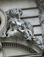
The Beaux-Arts style emphasized architecture parlante, meaning "speaking architecture," the concept that the building should engage in a dialogue with the viewer, thereby explaining its own function. As a result, each decorative element was connected to the building's purpose or situation. Words or names of noted artists or musicians were carved into steps, panels, or elevated bands, shields were placed above entrances, and panels were highly decorated with symbolic motifs. At the same time, Beaux-Arts architecture also considered the building within its wider context, representing and communicating current social values.
Industry and Technology
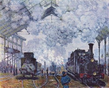
Beaux-Arts architecture was informed by the Industrial Revolution, which began in Britain, and as economist and philosopher Friedrich Engels wrote, "changed the whole of civil society." However, it was a Frenchman, Louis-Guillaume Otto, who first coined the phrase "Industrial Revolution" in 1799 to describe his country's race to modernize following the chaos of the French Revolution. The code civil, or Napoleonic code, was established in 1801 replacing various tariffs and guild restrictions with the rule of law, stabilizing the national currency, and creating public roads, canals, and the railway system. Mechanized factories, steam power, iron making, and the invention of machine tools led to mass production of various products and to rapid urbanization.
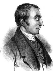
In this new era, Henri de Saint-Simon and Auguste Comte were the leading thinkers. Saint-Simon developed the concept of industrialism, where he argued that the recognition of the value and needs of the working class were necessary both to society and the economy. Comte, who worked for a time with Saint-Simon, developed a positivist philosophy of social evolution, believing that, "the only knowledge available to human kind is that of science grounded in observation". Saint-Simon and Comte's ideas influenced the leading philosophers of the 19th century, including Karl Marx, Friedrich Engels, and John Stuart Mills. The Beaux-Arts movement was informed by this rationalist and positivist approach and felt employing the technology, materials, and processes of the Industrial Revolution would create new buildings that gave expression to civic pride and social progress. In the same manner, they were particularly keen to incorporate the new technology of cast iron into their designs, creating iron frameworks that allowed buildings to be built on a grander scale, while also being more affordable and having shorter completion times.
International Expression
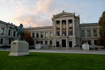
Apart from a few specific buildings, Beaux Arts had little impact elsewhere in Europe, with architects more likely to utilize their own national styles. The style, however, had a significant effect in the United States between 1880 and 1920, where it was also known as American Renaissance or American Classicism. Interestingly, there was also a fashion for Beaux- Arts designs in Argentina where the ruling classes admired and imitated French aesthetics. The style was first introduced to the country in 1868 by Julio Dormal, a Belgian who had studied at the École des Beaux-Arts, and it continued to be employed into the modern era as seen in Bustillo and Ángel Guido's design of the monumental National Flag Memorial (1957).
Later Developments - After Beaux-Arts Architecture
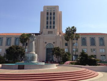
Beaux-Arts architecture had declined in France by the beginning of the 19th century as it was overtaken by the modern movements of Art Nouveau and, later, Art Deco. The aesthetics and ideas behind Art Nouveau were a clear a rejection of Beaux Arts, although it is possible to note some common themes between the two, particularly the use of new technologies. Although Art Deco also remained a separate movement in Europe, in the United States, elements of Beaux Arts were incorporated into Art Deco designs, creating public buildings which can be seen as an amalgamation of the two. This is particularly prominent in buildings completed between 1933 and 1944 as part of the Public Works Administration, when the fusion of the two styles became known as PWA Moderne.
Labrouste's work has slowly been re-evaluated in the modern era, beginning with Sigfried Gideon's 1928 argument that his pioneering and exposed iron structures can be seen as leading to the unadorned steel columns of Le Corbusier. Labrouste's rationalist approach and use of modern architecture can be seen as influencing Ludwig Mies van der Rohe and Norman Foster.
From the 1970s some postmodern architects began to reject modern functionalism and instead sought inspiration in historic architectural styles, combining elements from different eras to create an eclectic and, sometimes, contradictory appearance. Beaux Arts features such as classical columns, arched windows, and decorative statuary made a reappearance in the designs of architects such as Robert Venturi, Thomas H. Beeby, and Robert A. M. Stern.
In 1963, following the destruction of Pennsylvania Station, a Beaux-Arts building designed by McKim, Mead and White, Henry Hope Reed Jr. launched the Classical America organization. Advocating for the practice of classical training and the appreciation of classical buildings, the organization was renamed in 2002 as the Institute of Classical Architecture and Art. The Institute has a peer-reviewed journal and a number of programs, including the Beaux Arts Atelier, which emphasizes education in classical architecture, based upon the teachings of the École des Beaux-Arts. In Belgium, Leo Krier and Maurice Cult have advocated for classical projects, and in Britain Quinlan Terry became a leading proponent of the New Classical Architecture movement. He was described in 2006 by art historian David Watkin, as "the single most distinguished and prolific architect at work in the Classical tradition". The American New Classical architect Thomas Gordon Smith, as chair of the School of Architecture at the University of Notre Dame, has been an influential advocate for classical studies and practices, with the result that a number of universities, including The University of Miami, Andrews University, the University of Colorado, offer classical architectural programs.
Commercial architecture also continues to reflect the Beaux-Arts influence as noted resorts and upscale boutiques, employ classical facades done in ironwork. The Beaux-Arts style has also had a continued cultural presence, as its masterworks are among the most visited international tourist attractions and are used in popular media and advertising as iconic and instantly recognizable edifices that express the character of Paris, New York or other major cities.
 Ask The Art Story AI


