 Ask The Art Story AI
Image Comparisons
Mark Rothko
A prominent Abstract Expressionist, Mark Rothko experimented with several styles before reaching his signature 1950s motif of soft, rectangular forms floating on a field of stained color. Heavily influenced by mythology and philosophy, he remained insistent that his art was filled with content, despite the voids evoked by his pictures. A fierce champion of social revolutionary thought, and the right to self-expression, Rothko also explored his views in numerous essays and critical reviews.
Mark Rothko Artist Page Comparison #1
Rothko and Friedrich: Contemplating the Void
Mark Rothko
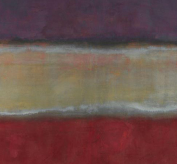
Untitled (Purple, White and Red) (1953)
Casper David Friedrich
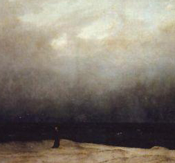
Monk by a Sea (1809)
Casper David Friedrich's Monk by a Sea, 1809, shows nothing more than a tiny figure contemplating the seascape, a scene so empty of incident that it bewildered spectators when it was first exhibited. Mark Rothko's Untitled (Purple, White and Red), 1953, is typical of his mature style, depicting rectangular shapes of muted color suspended in space.
Detailed view Comparison #2
Rothko and Mondrian: Abstraction and Spirituality
Mark Rothko
Untitled (Seagram Mural) 1959
Piet Mondrian
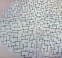
Composition 10, Pier and Ocean (1915)
Piet Mondrian's Composition 10, Pier and Ocean, 1915, brings the Cubist style to the brink of total abstraction, with a view of a pier jutting into the North Sea. Mark Rothko's Untitled (Seagram Mural), 1959, inspires thoughts of the spirit by similar means, stripping the picture of direct references to the outside world.
Detailed view Comparison #3
Rothko and Titian: Color and Spirituality
Mark Rothko
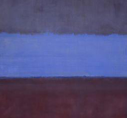
No. 61: Rust and Blue (1953)
Titian
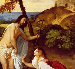
Noli me tangere (1511-12)
Rothko's No. 61: Rust and Blue (1953) uses layered color to enrich the hues in the painting and to lend it a quality that the artist described as that of "inner light." Titian's Noli me tangere (Do not touch me) (1511-12) takes a similar approach to color in order to lend a rich luminosity to the surface, one which will complement the work's religious subject matter.
Detailed view 


